Since we are still talking about book covers, I thought I'd make a post about some book covers I like. As stated in my previous post, I consider a title and cover to be one of the most important "hooks" a novel can have, when it is sitting on that boring old shelf at the bookstore. Again, went to Barnes and Noble yesterday, and it was clear some awesome covers stuck out, and some not-as-awesome covers made me just not care.
So, first, let's go by some authors!
Brandon Sanderson
Brandon has had some...really odd covers. First print Mistborn is too easy to pick on, so let's just talk about his first novel, Elantris.

So, here we have the US cover. Not bad, right? It doesn't scream "generic fantasy," but a casual observer has no idea what's going on. That's what bothers me a lot about covers: in order to know what is going on, you have to get a good 1/3 through the book. But the cover is there for people who don't know what is going on to be enticed. So, in that vein, wouldn't something artistic work better?

Hot damn! This is the German Elantris cover, and I often consider it the best of his (out of all his covers). Elantris is about a cursed city. This cover is simple, clean, easy on the eyes, and gets the idea across. It also looks cool. However, there is another Elantris cover that is also pretty rad...

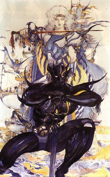
This is the Japanese Elantris cover. You can see the regional art style influencing it; it has a somewhat "anime" flavor. Plus, there's some weird rodant thing in the bottom right. I don't remember that being in the book. But dude: look how cool Prince Raoden looks! He's like a total badass! Though he does remind me of Cecil from Final Fantasy IV...
Ok, so Elantris has some good covers. What about some awful ones? Pretty much all the Warbreaker covers were pretty ugly.

This is the US release of Warbreaker. Truthfully, it's a decent picture, and I like the colors. The font looks like it was just done using a generic photoshop filter, and Sanderson is starting that whole "my name is bigger than the title" thing that people do when they get big. The problem with this cover is that it just...doesn't make sense. The first thing I thought when I saw it was, "Oh look, it's Storm from the X-Men eating a Fruit-by-the-foot." Seriously. It looks just like that. But somebody thought it was a cool idea, because the audiobook took the fuglyness to a new level.

Ignoring the fact that GraphicAudio advertises it as "A Movie in your Mind!" (hooray for brain invasion!), this picture is essentially like the first Warbreaker cover, except drawn by someone who graduated with an undergrad in pastels. There's just too much crap in this picture. Though, I do like the dress on the girl (I forgot her name; I kind of repressed Warbreaker from my mind).
But none of this compares to the current (?) Warbreaker cover, or at least the one they are advertising.

I dunno if this is a placeholder or something, but holy crap. I don't think I need to tell you why this cover looks awful. It should be pretty freaking obvious.
Robert Jordan
I've never liked the Wheel of Time covers, except the very first one. This is for the hardcover books. They've had the same artist throughout, and the usually depict some unknown scene from the book, and usually it involves them standing around or doing nothing. Seriously, not very exciting. Plus, since the series started like a billion years ago, what was popular for fantasy covers then just doesn't fly now. But, they still use the same guy (guess he signed some deal?) so we won't see the end of it until Brandon finishes the series.
This, however, is excluding the audiobooks. Let's take a look at just one of them, The Shadow Rising.

Well, out of all the Wheel of Time covers, this one at least has nice colors. You have two guys hanging around, smoking, while the woman is cooking. Yeah, ok, it's a bit of a sexist cover (why are the guys standing around while she does all the work? Shouldn't they at least be fighting baddies or something?), but there isn't anything (minus the blatant sexism) that leaps out at you. Compare this to the audiobooks, which all have totally different covers from the regular books.

Holy. Crap. There's Mat, who was previously just sitting around and making a woman cook for him, and is now walking in front of some gnarled old tree with ravens and a HUGE FREAKING SPEAR on his shoulders, looking totally badass. In fact, all the audiobook covers look significantly cooler than their hardcover equivalents. Wow.
Jim Butcher
If you've been to a store recently, you've seen Jim Butcher's books. All the covers are pretty much the same: the artist picks some background color theme (yellow, green, blue, etc.) and then puts a dark, brooding Harry Dresden in front, staff in hand, hat on his head (he doesn't ever wear a hat!), and with a black background. If you think these get a little repetitive, at least they don't print the original covers anymore.

Ugh. Look at that title. Each letter is in its own box? That looks freaking awful! All the way up until Proven Guilty (if I remember correctly), they used this style on the covers. It looks terrible. Just look at any of the reviews I've done, and you can see how much better it looks.
Before we move on, however, I'd like to point out a Dresden cover that I really like, a lot. It is actually the book I'm currently reading, and it has stuck out with me before I even started considering the series.

Now, this isn't much different from the other covers. Brooding Harry, with hat (ugh), and staff, obnoxious SciFi channel logo on the cover...all accounted for. However, you'll notice something completely different: THIS COVER IS WHITE. That's right; every Dresden book up until this point has been black themed, but this is the only white cover. Imagine, looking on a bookstore shelf. You have piles of black Dresden books, and suddenly this one lunges at you like an bastard child. It's brilliant. As of now, there is no other Dresden book that is white, though the next one (Ghost Story), which is a start of the new Dresden "season" is white. Are the next 12 Dresden books going to be white now? Except one, that will be black? I'm really thinking about this too much.
James Dashner
As a person, I like James Dashner quite a bit. He's got a sort of reserved, biting sense of humor that I totally enjoy. Having him on panels at Conduit and during his guest visit in Sanderson's class last Winter was a real treat. He pointed out then some of his book covers, and I'd like to pull up this horrible gem from his first series.
This just screams small publisher. Some generic kid's face (who gets flipped and put on the other side for the rest of the series' covers), and some generic landscape they probably googled and then slapped on the cover. Not to mention the title "A Gift of Ice" blends a little too well with the gray snow behind it, while the Jimmy Fincher Saga on top is orange for some god-only-knows reason. Ugh.
Then, he wrote The Maze Runner, and now has a big pool of money a-la Scrooge McDuck.

Yeah, it's an ok cover. Having the "James" and "Dashner" not line up perfectly gives it a modern feel, as does the odd font. The background picture is OK, though you have to look twice or three times to figure out what is going on, which I never thought was a great thing. Luckily, the foreign rights people knew how to make a cover totally awesome.

Holy movie poster! It even has a tagline: "Remember. Survive. Run." As we are a nation raised on media, that title is certain to grab you.
As a bonus, recently posted on Dashner's blog, we have the Brazilian version, which looks straight out of some horror novel.

Creepy. Though I think "movie poster" up there is still the best.
John Bellairs
As stated in my review, The Face in the Frost is one of my favorite books ever. The image I used in the review I considered to be an ok cover...it has an "early 90s" feel to it, but hey...it works. What doesn't work is the re-issue cover, that looks putrid.

Way to take my favorite book, and make it unappealing in nearly every way. This one is worst than the Jimmy Fitcher book above...they didn't even bother blowing up the background image to fill the cover. This doesn't even look "small publisher" bad...it looks "self published" bad. Bellairs deserved better.
Luckily, the picture on the audiobook is totally rad.

Yeah, there you go. Some sweet wizard looking in the green-glass paperweight and seeing a freaking skull. Plus, there's that cool mouse in the back. I never did figure out what that guy's deal was. Keep in mind, it was this cover, solely the cover, that caused me to pick up the audiobook fromt he library in the first place. So there's gotta be something there.
Orson Scott Card
I'll be honest: I'm not a fan of Mr. Card's work. I love his writing for the Living Scriptures cartoons, and Ender's Game and Ender's Shadow are great. I just don't like anything else he wrote (including the rest of the Ender series).
So, Ender's Game is a great book. But it has never had a good cover. Here's the one it had when I picked up the book (I totally grabbed it by random when I was like 12, by the way. Nobody suggested it; I just thought it was a book I would read).

Not bad. Plus it has a bunch of awards on it. However, I've read this book like 20 times, and I still have no idea what scene this is from the bok. Is this Ender flying to that space station at the beginning? Or maybe the one at the end? Or maybe on his super emo-journey at the very end so Mr. Card could put out more sequels?
One thing I do know is that it is a billion times better than this cover they put out a while back, when I guess they decided to try and market the book to kids.

Out of all the terrible covers I've posted, this one is my personal "most despised." Ender's Game is a dark book, about kids playing super-violent games and adults purposefully manipulating them to make them into soulless, killing tacticians. This looks like something out of Tron starring that kid from The Sixth Sense. It makes it look like fun, never mind the fact that they were shooting each other, swearing and intimidating each other constantly, and pretty much being put through kid hell. Just looking at the cover makes me want to punch whoever green-lighted it. Ugh.
Dan Wells
Yeah, these are primarily Mormon authors. I'm Mormon too, so it happens. Shut up.
Dan's book first made it big in the UK, and while I thought the cover was ok, it was uninspired.

I didn't think the US version was much better. It lost that super bright, eyeball burning red that just sears into your brain, but it also got really boring.

Better? Yeah. And there's some blood. But...why is it on a sheet of lined paper? What's up with that? No clue.
Then, Wells US cover artist got CRAZY good, and released two of my favorite covers ever.

Wow! These look great! Mr. Monster is my personal favorite (very minimalist, but surprisingly dark), and I Don't Want to Kill You also looks really fun.
Here's a cool link to his cover artist's walkthrough on how he decided to make these covers. It's a great read!
A few more
Here's a few more random covers I think look cool. Some are from books I've read, some not. I just like them.


Got some favorite covers? Let me know in the comments!
5 comments:
I disagree on the German cover—I wouldn’t pick that book up. To me, I see a castle. “Oh great, another castle. NEXT.”
I LOVE the Japanese one, though. That one is interesting. Best of the three Elantris covers.
For the American Warbreaker cover, I think the picture is gorgeous, but I couldn’t quite tell who it was. (It’s Suri, right? Was that her name?) And Is the sword supposed to be nightbringer or whatever Vasher’s sword was called? It doesn’t look like an evil sword (who, by the way, was the coolest character in that book), and why does Suri have it?
Wait, maybe the picture is Vivenna, since she’s the one who has the breaths. I hated her. She shouldn’t be on the cover. (And I pictured her with black hair anyway.)
The orange cover looks like a history textbook. oO;
That audio Robert Jordan cover looks great. I suddenly want to buy it, no joke. (I’m making these comments as I go through your blog.)
Brazillian cover for TMR definitely the winner. I also really like that title.
The lined paper from the American IANASK is probably based off John’s notebook that he used to track the baddie…
Random: I want to read Boneshaker.
Heh, Elantris the Anime. If that ever did actually happen I'd laugh my head off. And it's not like it's impossible, Miyazaki made 'Howls Moving Castle,' which is originally a book by Dianna Wynne Jones.
Oh wow, the WoT audio book covers really are better. Insanely so. O_o
You made me walk over to my bookshelf and look for covers. I didn't find any that I wanted to share particularly, but I did note that what I'm currently calling my favorite book, "Carry On Mr. Bowditch" has a cover that would have never made me grab the book. I read it under the recommendation of an aunt - the same one that got me into Jeeves. I'm mad that it doesn't have something a little more grabbing. In my anger I read the book again and blogged about it (http://whathowadsworth.blogspot.com/2010/07/carry-on.html).
Do not be fooled. Mr. Secrest's post is worth less than the electrons that are wasted in broadcasting it. Shy away from his works at all costs. Additionally, the question might be posed, "What kind of person shamelessly abuses the powers of comments to divert the readership of his friend's more popular blog to his own lesser blog?" It's worth thinking about.
When you arrive at the conclusion that Mr. Secrest is a fiend and a scoundrel, I invite you to join me in posting defamatory comments to tactically selected posts at whathowadsworth.blogspot.com. By doing so, two worthy goals are met: he is brought closer to resignation, and in the meantime something worthwhile and entertaining is left for the innocent readers who witlessly stumble upon his writings.
P.S. I submit that any cover sporting a skull, as shown above, is likely to drum up an audience.
Post a Comment